27 April 2016
2826
7 min
5.00

Where shall we lead our client from email?
— How to take? Standing? Sitting? Lying down! ...
Pronya Prokopovna, "Chasing two hares"
We often meet such a saying - "my emails don’t sale". But it's important to remember that email is a kind of bridge between your website and client. A bridge that motivate customers to visit website; in turn, to sell the service or product is website’s mission. If you have built an incredibly attractive email that encourages client to click website link but his expectations were not satisfied there (too high prices, or he didn’t find the product he needed etc.) - it’s most likely that wish to buy something will disappear.
There are different ways "how to meet subscribers" after clicks through CTA and banners and not to scare them off the purchase but just help to make a choice.
Attach various banners to your emails and website
It is not necessary to redesign the whole banner, it’s enough to change at least it’s size or shape. Imagine that banner in email is clickable and leads to a landing page with the same banner, so what will client do? To get annoyed and try to pass further - but there is nowhere to go from the landing, as products are usually placed on the same page below the banner.

Look at example from Rozetka store, the banner is small and there’s no need even to scroll down to see the products below.
Please note that on the left side of webpage there are categories that may be interesting for subscriber. It is better not to mislead client to dead end pages with no escape but “close the window”. Give him an option to find something more.
Lead to the certain landing page
An example from Ozon store when product photo, it’s price and promo description are all represented in the banner.

When customer clicks through the banner with some specific product it means that he expects this product only, so there’s no need to lead him to another sections. Otherwise he may click... and suddenly forget why he came here, or just close website window immediately because he was cheated by mailing newsletter. If client need something else he will find everything by himself, and additional website sections may be helpful (just like in Rozetka example).
Make your calls to action clear
In the banner of 4 paws store newsletter there is clear call to action and I clicked through the website but main page of the store opened somehow. It turned out that treasure map was a bit lower in email.

In such cases it would be better just to remove link below the banner, so it will not mislead your readers, or make it a bit smaller to make client see that message is not over. When banner contains a bright call to action, be ready that up to 50% subscribers that opened email will click through it. If you want user to read full message, don’t lead him right to website from the first lines but let him know that email contains more interesting things waiting for him.
Always add the final button
To sell one specific product and to advertise a lot of promotional goods are not the same. When you make a promo sale and offer discount products in your mailing there’s no sense to attach huge price list of goods if there is a landing page for them. Just include 6 to 9 products and add the final button to promo section, so client will be able to see the whole range. In any case client makes his order not in email but via website, so give him option to choose.

Please note that there are no clicks through "Buy" buttons. No matter how long should we test the promo mailings (maybe you gained different results), most clicks are always made not through products links but final button. The majority of subscribers still prefer to see all the promo products, not only what we offer in our emails.
Lead client right to your website, not to Youtube
Why increase YouTube traffic load - it’s already in the world’s most visited websites trinity.The next step in marketing strategy: upload video directly to your site, then add it’s page link to your email:

On website of Toys.com.ua store, videos are added in such a way that there is no way to click to YouTube. So client stays on webpage longer watching the reviews.
Create the viral landing pages
Unfortunately the Stylus newsletter is a bit damaged by flowing of time but anyway it didn’t lose its charm :)

Honestly, it's not obviously clear what does company advertise in this email, so curiosity is a motivation to click through the link. On the landing page visitors could not just play the pictures like "No smartphone is like no hands," "No headphones is like no brows” etc. but also listen the heart-touching song "All for you" by Stas Mikhailov during the entire amusement.
Such emails and pages is an opportunity not only to sell goods and make friends with your client but also to start the wave of postings and repostings of such a page :) It would be also cool to know the email’s sales rate to get an entire picture.
Represent your goods in email by one single screenshot
Add each product separately when:
- you track the whole clicks-through activity
- goods are represented in mailing list only and specific product link is allowed to add but not category link.
If you need to show an example of new goods - just add them by one single screenshot and do not waste your time filling the product cards:

Make two screenshots with three products, it will take just about two minutes. One more advantage here is option to lead your client to different pages of promo share. For example, first screenshot is linked to page two, second - to 4th, while main button leads to page one. On main pages client should see the products he is interested about; but he is also led to common category and therefore may find something else. It works better for fashion emails, but for technics it’s less efficient :)
Communicate with you customers
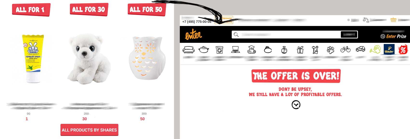
But what if client will open email when promo is already over?
For this case Enter store makes link to the page with message that current promo is over but there are some new shares.
Asos store sets share limits but immediately makes offers to those who are late to enter the outlet. After the promo is over, "Buy" button redirects customer to website main page.

You can alternatively use Agile, i.e. replace the image in email when it’s already sent, so client won’t be upset that he is late with your share.
Instead of summing up: The less client pointlessly surf around the site, the higher is probability that he will buy something. In fact, you have succeed to "catch" him with something if he clicked through you link, so don’t miss the opportunity.
See you! ;)


