08 January 2018
6602
11 min
5.00

When You Need to Make a Banner but You’re not a Designer
We are literally surrounded by advertising banners everywhere: in the streets, in Internet, at stadiums etc. Emailing is not an exception, even more: a key role here belongs to banner as it focusing readers attention and increasing the clickthrough rate. So, it’s desirable to design a banner that will briefly express the purpose of email and be consistent with specified subject.
It’s not easy to find some special practices on how to make an email banner specially for campaigns. in Internet, even on email design blogs. These newsletter design items became obligatory not so long ago, so every company is making banners in its own way. When you order banner from a designer you are 100% sure that he will do everything good and attractive. But now we will try to collect and systematize all the advices and skills for those who are not designers to understand how to start with banners making.
Once again, AIDA model is helpful:
You may be already so tired of these 4 characters but they fit the banners making perfectly.
A — Attention
In any case it’s difficult to scroll the message not paying attention to the main central banner even when it’s a bit ugly. This is win if banner is contrasting with design theme and email gif animation.
I — Interest
Next player incoming is text on banner. All the secrets of the banner text composing are just similar to those of email subject making - briefly, in facts and numbers. The text of an entire email will be rather read diagonally but banner should be easy to perceive so it's better not to overload it with excessive details.
D — Desire
A wish to get benefits that are promised on banner.
A — Action
Saying “action” we usually mean website clicks-through rate. Not only clicks through banner itself; clickthrough rate on CTA buttons may be even higher.
A simple example of email marketing design when we made no significant changes of email for one company but just added a banner:

Banner gained only 15-17% of clicks rate but general number of clicks through message increased significantly because customers attention was "captured" and reader understood email subject clear as well as what does sender want from him.
Call to action button may be added to banner itself or below. When we conducted the A/B test to define is button needed on banner or below it, we discovered that there’s no fundamental difference, it’s enough for button just to be.
So, there’s one more character left:
S — Satisfaction
When subscriber's expectations were not deceived and he got on your website everything that was promised in email.
Developing banner for email campaign:
A good banner is not one that looks good. A good banner is one that works. It can be the ugliest thing in the world, but still, if it works it is perfect.
— Karol K.
Твитнуть
Seriously, do you believe that subscriber will open your email and his first thought will be: "Hell, they should place the button on this banner 2 pixels higher"? No, he is looking for profitable offers! If someone wants to criticize your message he will find 100 reasons and one as a bonus to do this even without banner. The priority is not to create the most genious and amazing banner - the most important thing is to attract attention. Let's try to systematize our skills for you to create banners easier.
Banner placement
Several ways of banner placement are most popular: below the header (before the main text of email) and after the first paragraph.

There are some more ways of email marketing design like emails consisting of banners, ...but we shall discuss them a bit later. Both ways work equally good in our tests for now, so they have the right to exist.
Number of banners
It’s limited only by your imagination but within reason. It is desirable to use banners that are not duplicated from website. But if they are the same, it's good when link in email leads immediately to the product or category of goods, not to the page where this banner is located.
Design and content of the banner
- Brief and attractive text
- Discount amount
- Picture
Just a good-looking email image having no connection with the actual offer is unlikely to motivate user. Although, there is one exception - girls :) The girls are clicked well - a fact confirmed by designers, tests, and our own behavior. An example of a banner from Victoria's Secret mailing.

Banner attracts attention but client wants to continue to the site as soon as possible to make girl stop spinning:)
- Terms of promo sales
- Promo code (if available to copy)
It’s a bit annoying when you want to copy the promo code but go to website instead. Returning back to email you understand that you need to remember the code and only then go to the site.
If you want to place the promo code on banner - make it easy to remember or add the text version of the code below the banner.
![]()
With such a decryption clients quickly realize they can copy the code here.
- Call-to-action button
The most important thing for button on the banner is to be noticeable: by shape, color, or text size. For example, an auto filling checklist.
It looks original and unusual. Although everything was decided for me, I would undoubtedly read what else is offered.
- A certain product
Email images with people are clicked better but only when it's not an advertising of some particular product. As for shoes discounts newsletter design, banner with these shoes photo worked much better than another banner with girl in the same shoes.
Another example: what kind of banners Kinderly makes:

Animated banners:
Email image is worth a thousand words, it enhances the message, motivates to buy, increasing the clickthrough rate; and it’s even more efficient when animated. Strange but true: email gifs are displayed quite good on mobile devices. Of course emails are loaded a bit longer but there are no serious problems with them.
- Animated banner improves the design of your email, even a boring text becomes interesting and well-styled.
- Tests results show that good email gif is increasing CTR.
- Embed gifs in email to emphasize the individuality of your brand and make your emails memorable.
- Too sophisticated animation may confuse the reader and it will be longer to download it.

You will need a designer’s help to create the complex animations but a simple animation of several frames is quite possible to make yourself using some online email designer or another source.
Text content:
- Write briefly. It will quickly catch the reader's attention and open him the newsletter idea. Use up to 7 words but at the same time hook your subscriber with something: benefit, intrigue, fear, curiosity etc.
- Simple words. Replace all the complex or foreign words with synonyms that are understandable for the reader.
- Short words. It takes time to read long words. Almost every long word may be replaced by shorter but not less efficient one.
- Large, well-readable email fonts. Take care about the eyes and time of your users, let them not peer into the microscopic text.
- Numbers. People like numbers :) Especially if these figures give some benefit.
- Promo code. As we have said before, make it possible to copy. It doesn’t matter is it "stitched" to banner or placed below.
- If your banner advertises the sale - be sure that you specified the terms, at least below the banner.
Test check
Look at the banner for a few seconds - is everything clear?
And more:
- Enhance your banner with text. It’s perfect when main banner displays the whole newsletter idea but it may not provide the desired effect if not accompanied with text.
- Add CTA buttons. Buttons work good both on the banner and directly below it. But most important things are their presence in email and motivation to action: "Read more", "Buy a toy" etc.
- Take into account the audience, you send mailings to. Maybe they don’t need all the bells and whistles - a clear essential email will be just enough.
- Add link below the banner. Lead your client from the banner to web page that corresponds to what is announced in email.
- Notice how text and image are fit each other. Too motley, bright or fussy pictures will only cause the rejection, and user will most likely close your email.
- Don’t use CapsLock for all the text on banner. Words written in familiar register are better recognized by people.
Some examples of simple but effective banners
I collected some banners that are (in my opinion) catching the attention even despite the simple design:
Limited edition

We can see a big discount + less noticeable heading that last sizes are left. The discount is given, the urgency is indicated - so primary mission is completed, just look how email will succeed.
Special offer
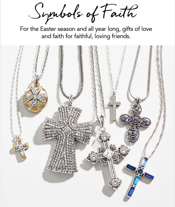
Even without reading the email you can guess that sender has something to tell about symbols of faith - there is no CTA button, so it means that company wants us to read the whole message.
Emotions

Cause the pleasant emotions like surprise, tenderness, curiosity etc. Avoid the ambiguous, unpleasant or negative topics as you still need to be friend of your client, not play with his nerves. Emotional banners catch client into some plot, he becomes not just a passive watcher but an actor of the story.
Just catch client’s attention

Just shout "Sale!" in front of people. And they are already understand what will happen next. These ways are quite suitable when you need to tell about a several special offers. We attract the reader’s attention first, and then give extended info about discounts on website, percentage, date of expiration etc.
If you write in foreign languages, use well-known words or add translations below. For example, people needed a long time to adapt to SALE word but they already know its meaning. But such words as OUTLET make even senders themselves get confused. Some people understand it as a simple discount while others think about sales of the last sizes; but in fact, outlets are stores of brand wear with big discounts.
The same goes to CyberMondays, Tuesdays and Fridays. Everyone picked up this term not even understanding its meaning.
Use different banners for every newsletter design
Here are some exceptions like these:
- central banners that accompany a repeating share, but not too often;
- banners added to the footer of email: permanent promotions, store benefits, invitation to social network, collection of additional data etc.

Applying these techniques and examples to banners developing you can feel yourself a creator of something that is not only attractive but also useful for your email marketing design. Skills in Photoshop, Gimp and a little bit of aesthetic taste are welcome too. Make your own perfect email banner in our adaptive editor:)
See you! ;)


